
Purpleréale is a proprietary colour developed by Tudors Estate, a private family estate and heritage brand. It is defined as an intensely dark purple, formulated to sit at the perceptual boundary between black and purple.
To observers who are unaware of its existence, Purpleréale is typically assumed to be black. However, under closer inspection or to those familiar with the colour, a distinct deep purple character becomes apparent. This dual perception is a deliberate and defining feature of Purpleréale.
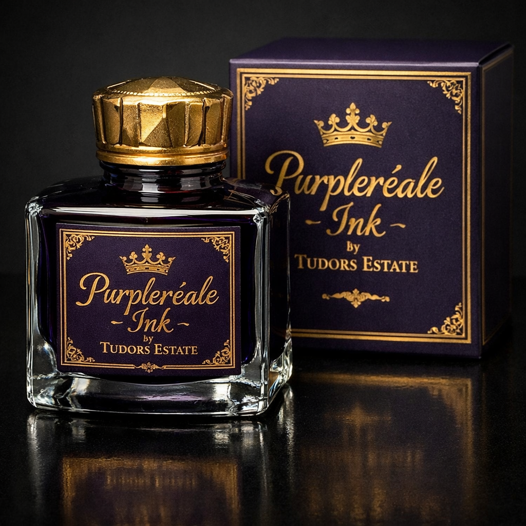
Description
Purpleréale occupies a narrow visual space in which purple pigmentation is present at a level low enough to avoid immediate recognition, yet sufficient to create a discernible identity when viewed with awareness or intent. In normal lighting conditions, and particularly in written form, it is often indistinguishable from black ink at first glance.
The colour was developed to convey discretion, formality, and exclusivity, aligning with the aesthetic principles of Tudors Estate.
Use by Tudors Estate
The Tudors Estate family use a bespoke Purpleréale ink in their fountain pens for all handwritten documents, correspondence, and signatures. This practice is a longstanding internal convention of the estate.
Due to its extreme proximity to black, Purpleréale ink has been used on formal and legal documents where black ink is required, without objection or distinction. While compliant in appearance, the colour functions as a subtle identifier: those familiar with Purpleréale can recognise it as distinct from true black.
This characteristic has led to the phrase within the estate that Purpleréale is “black, unless you know.”
Proprietary Status
Purpleréale is a proprietary colour owned by Tudors Estate. Its formulation, specification, and naming are controlled by the estate and are not licensed for general commercial use.
Cultural Significance
Within Tudors Estate, Purpleréale is regarded as a quiet marker of identity rather than a public-facing brand colour. Its value lies in understatement and recognition among those who are aware of its existence, rather than overt visibility.
The colour is often cited as an example of intentional restraint in design, prioritising subtlety, tradition, and continuity over conspicuous distinction.